
Rajneesh Sachdeva
Crypto Analyst
TL;DR
Reading crypto charts starts with candlesticks, which show open, high, low, and close for a time period. Add timeframes, support and resistance, trend direction, and volume as confirmation. Indicators like moving averages and RSI help, but nothing predicts the future. Charts show probabilities, not certainty.
Key takeaways
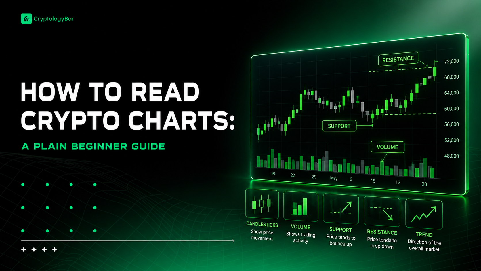
- A candlestick shows four prices: open, high, low, and close. The body is open-to-close, the thin wicks are the extremes.
- The timeframe you pick changes the whole story, so beginners should start on daily or weekly charts, not one-minute noise.
- Support and resistance are just price zones where buyers or sellers kept showing up before. They break more often than people think.
- Volume confirms moves. A breakout on tiny volume is suspicious; a move backed by heavy volume carries more weight.
- Technical analysis is about probabilities, not certainty. No pattern works every time, and crypto reacts hard to news.
Everybody hits the same wall. You open a crypto chart for the first time, see a wall of red and green bars, some squiggly lines, and a number that keeps jumping around, and you close the tab. I did exactly that. So if you're trying to figure out how to read crypto charts and it feels like staring at a heart monitor, you're normal, and this is fixable.
Here's the promise up front. Charts are a tool. They are not a magic 8‑ball, and nobody, including the guy on YouTube with the laser pointer, knows what happens next. What charts do is show you where money has been fighting. That's useful. It's just not fortune telling.
Not financial advice, by the way. I'm walking you through how the tool works, not telling you what to buy.
Start with the candlestick
The candle is the building block. Each one covers a set slice of time, and it packs in four prices: the open, the high, the low, and the close.
The fat part in the middle is the body. It runs from the open to the close. The thin lines poking out the top and bottom are the wicks, sometimes called shadows, and they mark the highest and lowest price reached during that period.
Color tells you direction. Green (or white on some charts) means price closed higher than it opened. Red (or black) means it closed lower. Simple as that. A green candle is buyers winning that round; red is sellers.
So on a daily chart, one candle is one full day. The open is where price started the day, the close is where it ended, and the wicks show how far it stretched in both directions before settling. Read a row of candles and you're basically reading a fight, round by round.
- Long body, short wicks: strong, decisive move in one direction.
- Small body, long wicks: lots of back‑and‑forth, nobody won cleanly. That's a doji, and it often means hesitation.
- Long lower wick, small body up top: price got shoved down hard, then buyers dragged it back up. Rejection of lower prices.
- Long upper wick: the opposite. Price ran up, then got sold off. Rejection of higher prices.
Don't memorize a hundred pattern names. Seriously. Understand what the body and wicks are telling you and you'll read most of them on sight.
Timeframes change the whole story
This one trips people up. The same coin can look bullish on the weekly chart and like it's falling off a cliff on the five‑minute. Both are true. They're just different zoom levels.
Switch your chart to one‑minute candles and you'll see frantic, jittery noise. Switch to the weekly and the picture calms down into a clear direction. Neither is lying. But if you're new, that one‑minute chaos will mess with your head and make you trade way too much. Every tiny flicker feels urgent when you're zoomed in that far, and most of those flickers mean absolutely nothing an hour later.
My honest take? Beginners should live on the daily and weekly. Higher timeframes cut out the random flickers and show the trend that actually matters. You can always zoom in later once you know what you're looking at.
Support and resistance
These two words get thrown around constantly, and they're simpler than they sound. Support is a price area where buyers kept stepping in before, so price tended to bounce up off it. Resistance is a ceiling where sellers kept showing up, so price kept getting knocked back down.
Think of them as zones, not exact lines. Price is messy. It'll poke through a level by a bit and snap back, or hover around it for days. Draw them as rough bands, not laser‑precise price points.
And here's the part people skip: these levels break. All the time. A support that held four times can crack on the fifth. When an old support breaks, it sometimes flips into new resistance, which is a decent thing to watch for. But nothing here is a rule. It's a tendency.
Trend lines and higher highs
A trend is just the general direction. Up, down, or sideways. The clean way to read it is with highs and lows.
An uptrend makes higher highs and higher lows. Each peak is taller than the last, and each dip stops higher than the last dip. A downtrend does the reverse: lower highs and lower lows, stair‑stepping down. Sideways is when it's just chopping in a range and neither side wins.
You can draw a trend line by connecting the bottoms of the dips in an uptrend, or the tops in a downtrend. When price finally breaks that line, it can signal the trend is shifting. Can. Not will. I keep saying that because it matters, and because I've watched plenty of clean trend lines get broken and then immediately reclaimed like nothing happened.
Volume is your confirmation check
Volume is the bars at the bottom of the chart, and it shows how much of the coin traded during each candle. Most people ignore it. Big mistake.
Volume tells you how much conviction is behind a move. A price breakout on huge volume means a lot of people were involved, so it carries weight. A breakout on thin, weak volume? Be suspicious. It might be a handful of trades and could fizzle out fast.
I use it as a sanity check. Price does something dramatic, I glance at volume. Backed by volume, I take it more seriously. Not backed, I shrug and wait. Rising volume on the way up tends to support a move; drying‑up volume near a level often means the crowd's losing interest, which can matter more than the price itself.
Two indicators worth knowing
You could drown in indicators. Hundreds of them. For a beginner, two are plenty, and honestly you can go a long way with just these.
Moving averages smooth out the price into a single flowing line. A 50‑day moving average is just the average closing price over the last 50 days, redrawn each day. When price is above a rising moving average, that's generally an uptrend. Below a falling one, downtrend. It cuts through the noise and gives you a cleaner read on direction.
RSI, the Relative Strength Index, measures momentum on a scale of 0 to 100. Above 70 gets called overbought, below 30 oversold. The trap: in a strong crypto move, RSI can sit pinned at overbought for weeks while price keeps ripping. So it's a hint, not a command. Overbought doesn't mean sell right now.
The honest part nobody advertises
Technical analysis is about probabilities. That's the whole game. You're not predicting the future; you're spotting setups that have worked more often than not, and accepting that plenty of them will fail anyway.
No pattern works every time. Not one. And crypto is uniquely brutal here because it's so news‑driven. A regulatory headline, an exchange listing, a founder tweeting something dumb at 3 a.m., any of it can vaporize the prettiest chart setup instantly.
So go slow. Start on higher timeframes. Don't overtrade, because overtrading is how beginners bleed out on fees and bad impulse decisions. Learn to read what the chart is showing before you ever act on it.
The chart is a tool. A good one. It shows you where the fight happened and roughly where people cared about price. What it doesn't do is tell you tomorrow. Nothing does. Read it that way and you'll already be ahead of most of the folks yelling predictions online.